
Increasing access to better financial tools can help accelerate the rate at which people move out of poverty and help them maintain economic gains. The Financial Services for the Poor (FSP) interactive web map is designed to inform decisions for expanding financial services access in sub-Saharan Africa and South Asia.
The data and tools help users target investments that expand access for maximum impact, and help them optimally place retail access points.
The data and tools help users target investments that expand access for maximum impact, and help them optimally place retail access points.
My role
My role was Creative Director and UI/UX Lead. I worked on strategy, research and discovery, wireframes, design and maintenance.
The Financial Services for the Poor group at The Bill and Melinda Gates Foundation approached SpatialDev with the request to create static maps with cut-and-dry GIS analysis that they could present to their market. They wanted to come up with a single summary score for every country they were involved in. They reached this score by analyzing the number of unbanked people in each country that can be reached and helped by using mobile texting technology.
SpatialDev was one of three different partners that they were working with. The second partner was the data collection team: a South African group that was on the ground in Africa collecting data (driving around, taking pictures of different financial institutions and location). The third partner was the University of Edinburgh, whose task was to put together the population calculation data that we used in our analysis.
SpatialDev was one of three different partners that they were working with. The second partner was the data collection team: a South African group that was on the ground in Africa collecting data (driving around, taking pictures of different financial institutions and location). The third partner was the University of Edinburgh, whose task was to put together the population calculation data that we used in our analysis.
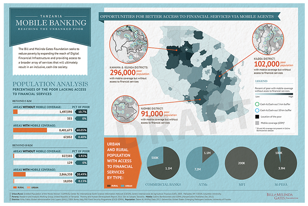
The client’s request was to create static maps and visualizations that they would use in their presentations.
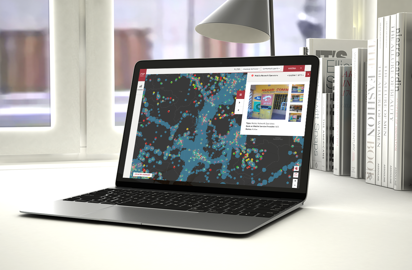
We developed and delivered these static maps and data summaries, but as a team, we felt that we could give our client and their partners a much more tailored experience by developing an interactive map. This interactive web map allows the user to decide how to dissect the different datasets and how they prefer to view these visualizations, which means that the user is able to control the type of data they are viewing on the map at any point.
FSP was built using a PostGreSQL DB (where we stored the data), Node.js middleware (the bridge between the data sitting in the database, and the web UI), and jQuery + HTML for the frontend.
FSP was built using a PostGreSQL DB (where we stored the data), Node.js middleware (the bridge between the data sitting in the database, and the web UI), and jQuery + HTML for the frontend.
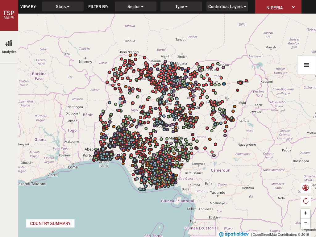
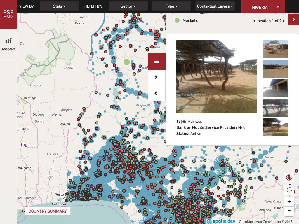
Users can filter the type of financial institutions they want to view on the map and at the same time turn on contextual layers such as mobile coverage and population density to help understand the landscape of banking access to the poor in the country.
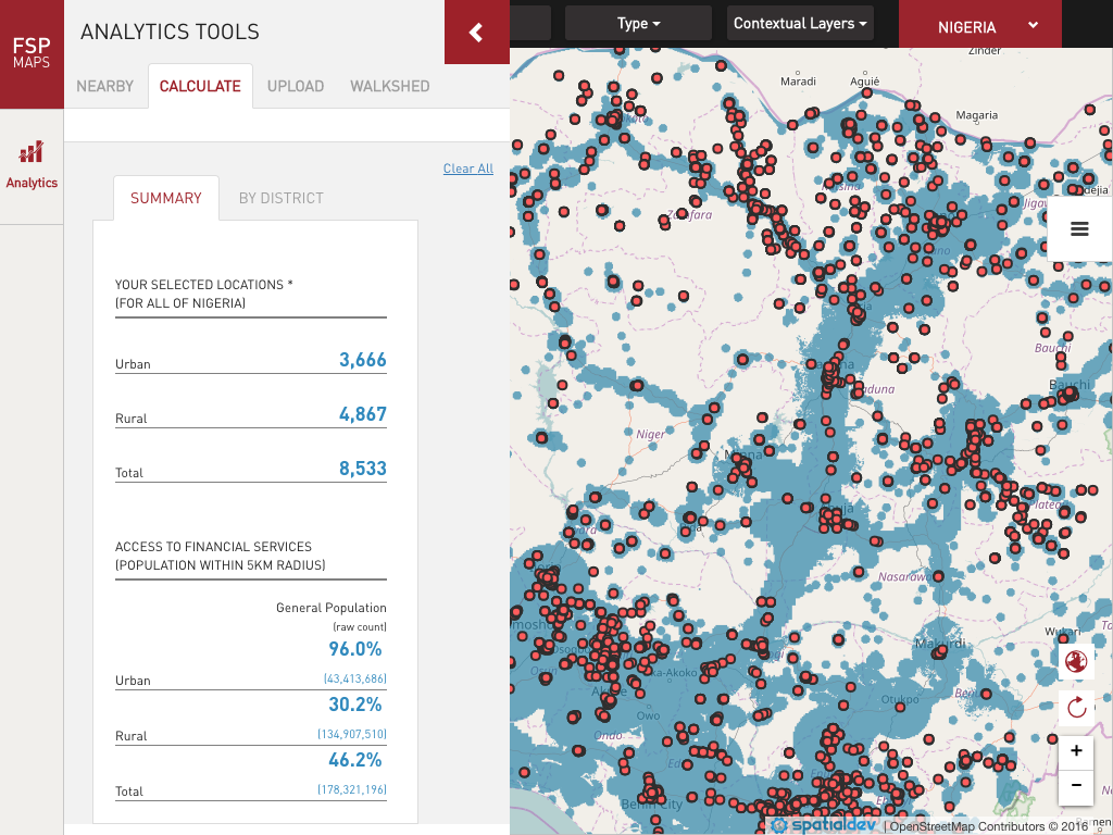
The app calculates and aggregates data on the fly and summarizes this data to the user in an easy and intuitive manner.
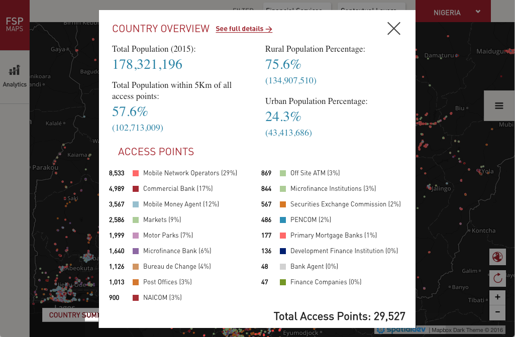
Users can click on the “country summary” button at any point of the experience to view some high-level stats and summaries.
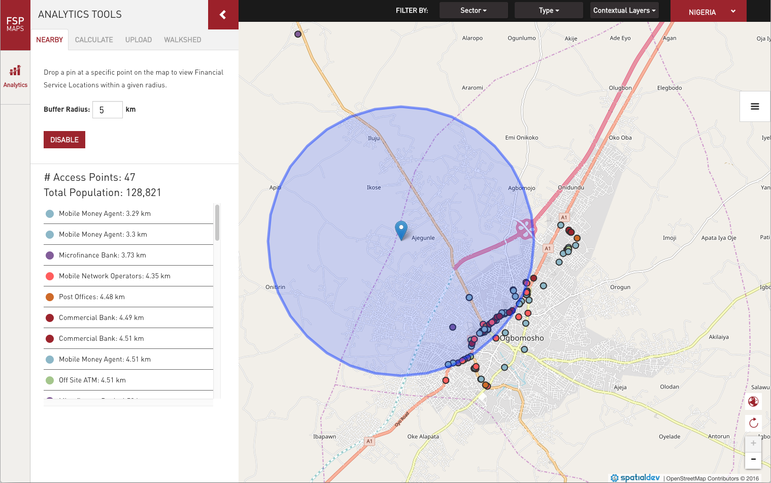
An inclusion analysis tool allows users to see a summary of populations in poverty within a defined distance of the access points. For example, users can select any financial access types along with a radial service area to assess its current or potential customer base. A map showing the results accompanies the summary report.
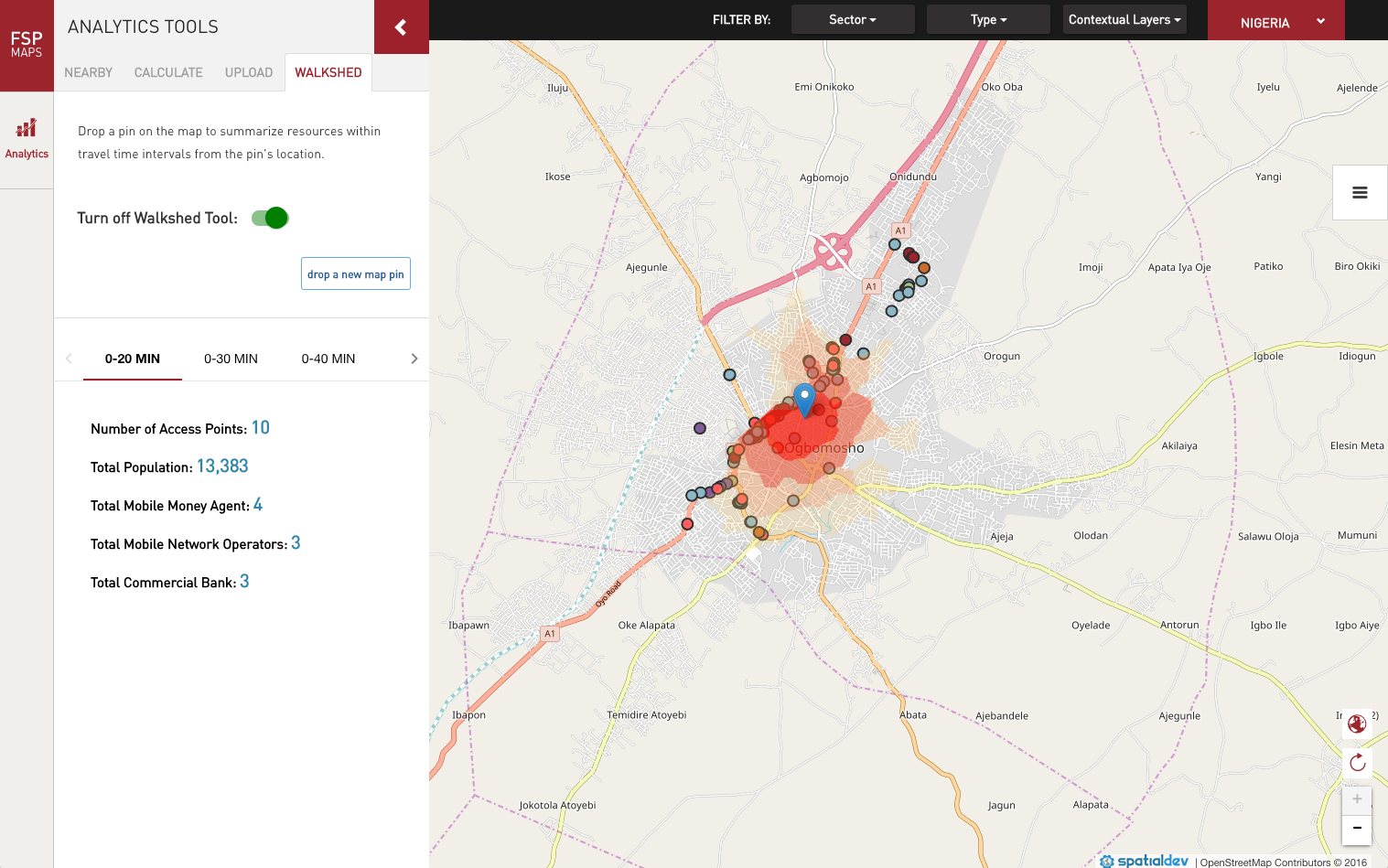
The travel time walkshed tool allows the user to drop a pin on the map to see how long a person needs to travel (by foot, by car or by bike) to access a financial institution. User can choose the travel time they want to view.
This interactive map was very successful and ended up being used by not only The Bill and Melinda Gates Foundation but also by folks on the ground in Africa, other NOGs (is it NGO’s? non-governmental organizations) in different countries as well as decision makers in governments and banking institutions.
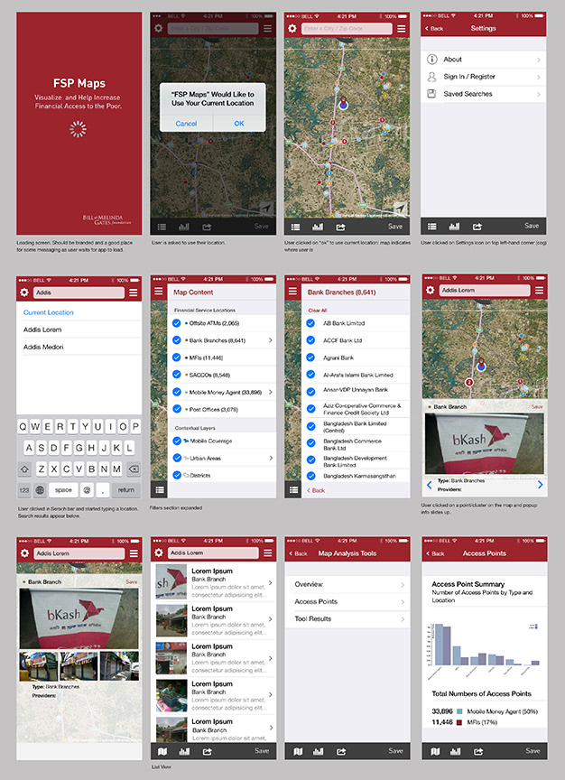
I started designing the mobile version of this app but due to lack of funds, we ended up not developing the mobile site.