
The Danish Refugee Council’s Joint IDP Profiling Service (JIPS) enlisted SpatialDev to develop a dynamic and interactive web-based data management system that allows users to extract information vital to their work. Profiling data is uploaded, accessed and analyzed continuously, and individual users from different agencies and departments can create and extract their own tables, graphs or maps. The tool features an uncomplicated user interface that is easy for non-technical users to navigate. Users can view statistics in a variety of visualization styles, share a map and summary statistics and download data.
The tool is used to provide national and global level decision makers a way to access profiling data quickly after surveys are collated; to facilitate analysis and reporting of profiling data collected in situations where people have been displaced; to promote field-to-field collaboration to ensure that profiling data is shared and used effectively; and to reflect mainstream best practices in terms of data analysis and data visualization.
The tool is used to provide national and global level decision makers a way to access profiling data quickly after surveys are collated; to facilitate analysis and reporting of profiling data collected in situations where people have been displaced; to promote field-to-field collaboration to ensure that profiling data is shared and used effectively; and to reflect mainstream best practices in terms of data analysis and data visualization.
My role
For this project, I worked as the Creative Director and UI/UX designer alongside a full-stack developer. Together, we collaborated very closely with the client to make sure that we are capturing all the functional requirements, staying within brand guidelines and delivering a product that the client will find useful and easy to use.
The goal of The DART is to simplify joint analysis and to enable everyone to take part in the management system. It’s built with field practitioners in mind and helps technical and non-technical partners work together to analyze and interpret the same data.
The DART is split into two main features:
1. Analyze the data
2. Build reports leveraging the data
The DART is split into two main features:
1. Analyze the data
2. Build reports leveraging the data
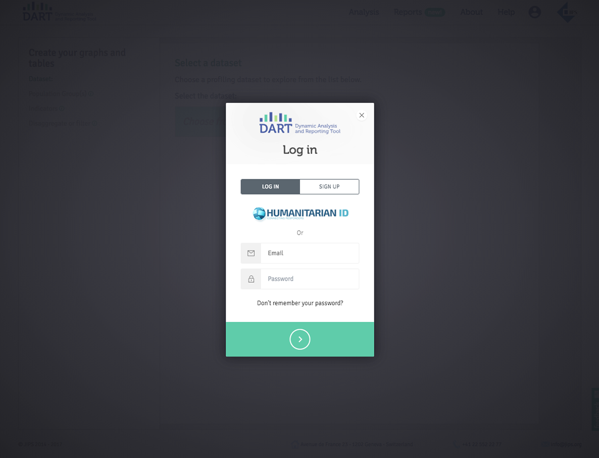
Creating an account or signing in with a Humanitarian ID unlocks The DART’s fullest potential such as saving your charts and graphs and sharing and collaborating with partners.
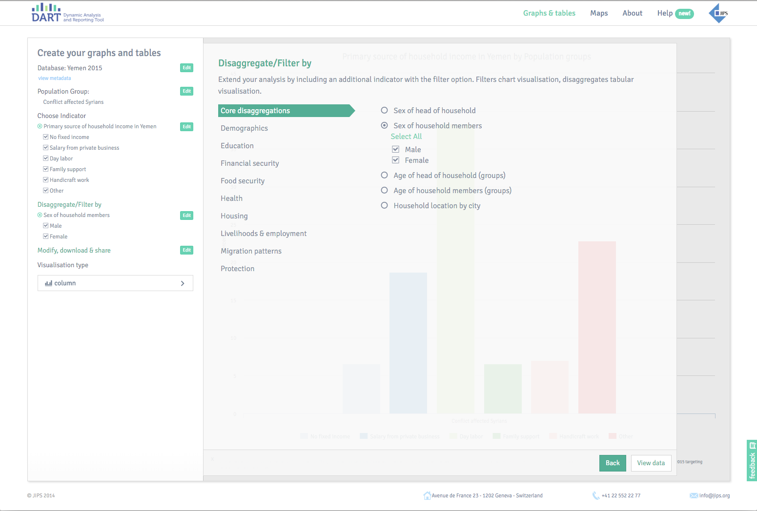
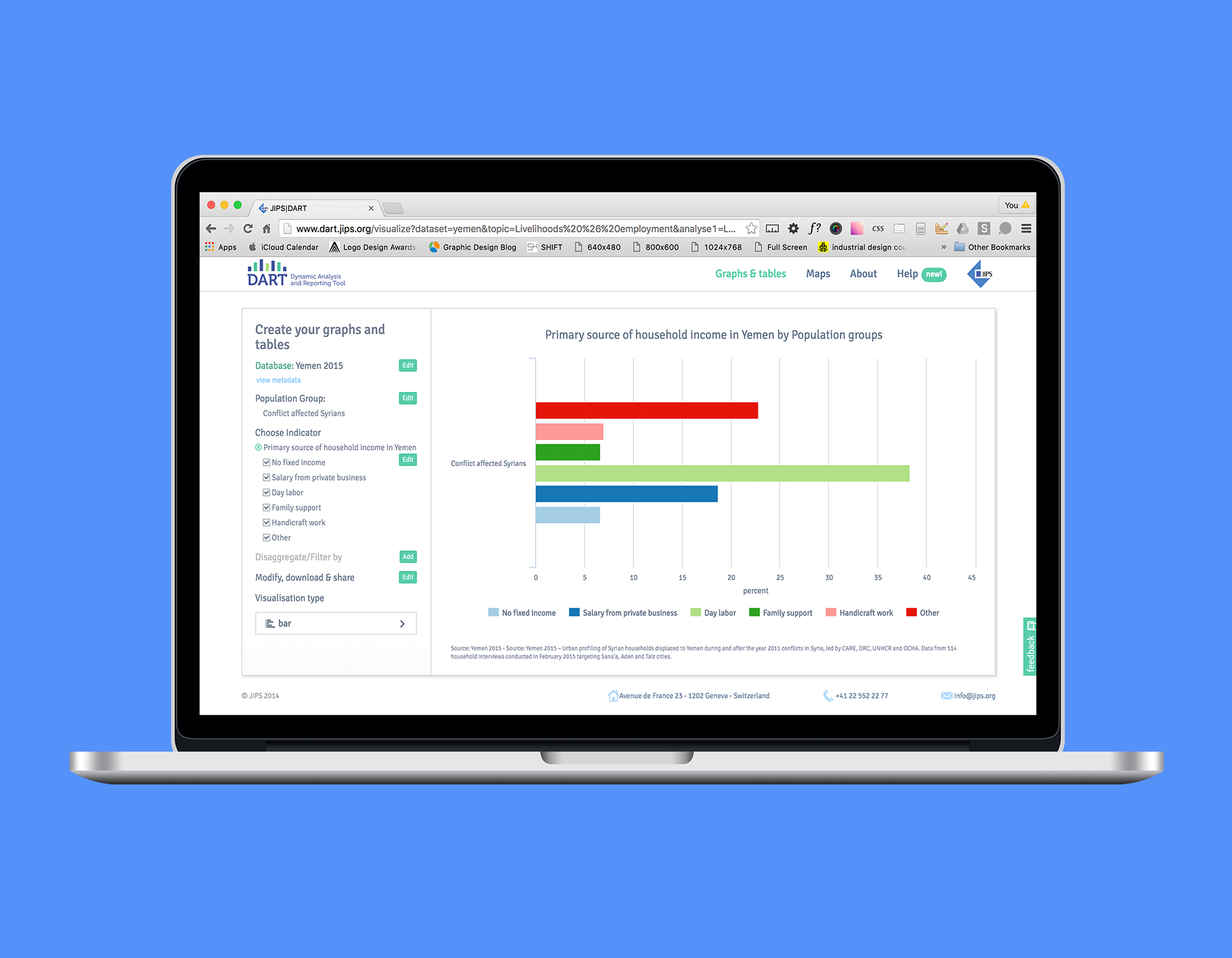
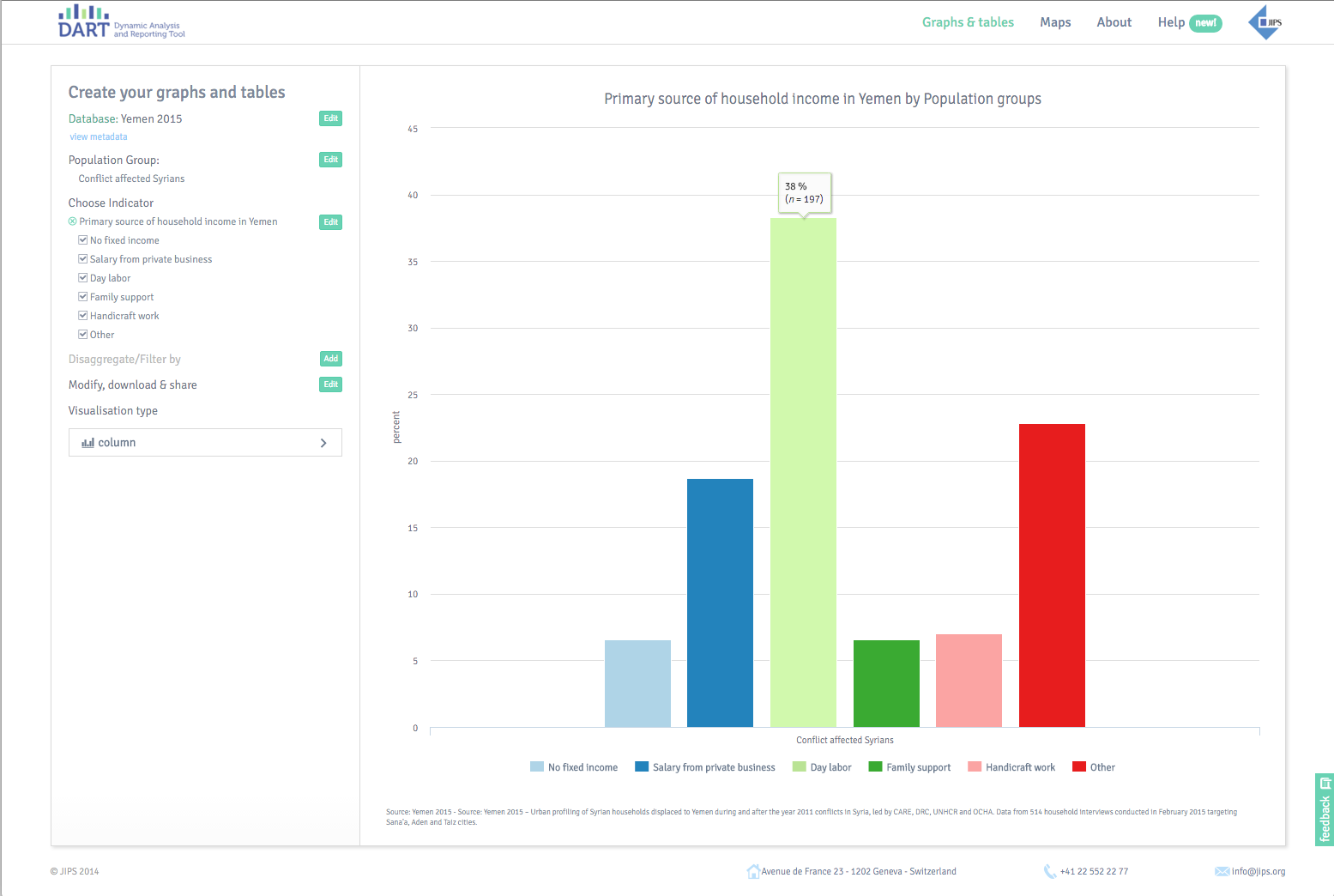
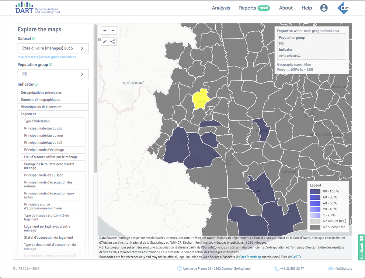
The app allows a user to create a graph, explore, analyze and visualize the data and then export that data in various formats. User can easily modify and filter the graph to adapt it to their needs. Digging into the data further brings even more analysis results.
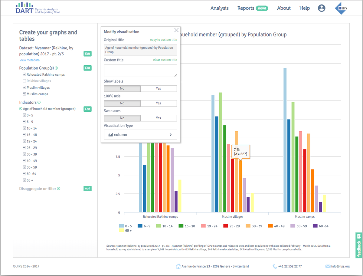
User can modify the graph to adapt it to their needs.
Results:
The JIPS team and their partners use this visualization management system as a useful tool for their organizations as well as a resource that helps them partner with other humanitarian organizations to help in consolidating and maximizing efforts.
The JIPS team and their partners use this visualization management system as a useful tool for their organizations as well as a resource that helps them partner with other humanitarian organizations to help in consolidating and maximizing efforts.