Background
Salesforce is a cloud-based software platform offering tools to help businesses manage sales, customer service, marketing, and more. Users can analyze and visualize their data by creating and exploring customizable reports and dashboards, enabling insights to drive business goals, improve revenue, and manage expenses.
To create reports in Salesforce, the user starts with selecting a report type, which defines the objects, fields, and relationships included in the report. There are two main report types: Standard Report Types (predefined and uneditable) and Custom Report Types (created by admins for tailored needs). Custom Report Types (CRT) allow users to define object relationships and field selections, enabling up to four objects to be linked. Custom report types offer flexibility to build and adapt reports to specific business requirements. They provide capabilities that go beyond what standard report types offer. They enable users to create highly tailored and precise reports, ensuring that the data presented meets specific business requirements and insights.
Problem Statement
The Custom Report Type feature, designed over a decade ago, has remained unchanged since its initial creation. This outdated setup has drawn significant dissatisfaction from reporting customers, who have provided feedback pointing to issues with the user interface and editing flow. These concerns highlight the need for a modernized and more efficient setup experience to better meet user expectations.
“It's 2024. How and why is the Custom Report Type Editor UI still stuck in Classic? Yes, some retro video games are making a comeback nowadays (thanks, Nintendo!), but features being stuck in Classic shouldn't be a thing anymore...” - Customer 1
“The creation of a custom report is not that bad - it's editing existing custom reports to either add or remove fields that is very painful. And in some larger orgs there are hundreds of custom reports types tied to thousands of reports, so deleting and creating new custom reports is not an option.” - Customer 2
Goals & Objectives
This project aimed to address longstanding customer pain points by prioritizing immediate needs, including:
- Upgrading the UI from Salesforce’s Classic interface to the current Lightning Design System.
- Help our users to quickly find the objects they are looking for on the Custom Report Types landing page.
- Introduce more context and details about the objects and object relationships throughout the custom report type creation process.
- Simplify the editing flows of the custom report type creation and editing process.
- Evaluate the overall design and flow of Custom Report Type (CRT) setup and creation experience.
The Team
This project was something that our customers have been asking for for a long time but that we never had the ability to squeeze into our roadmap. We formed our small yet mighty team and with minimal resources and a very tight deadline we had to ensure to move in a quick and agile manner.
1 Lead UX/UI Designer - 1 Product Manager - 1 CX writer - Five Engineers
Discovery
Though we already had strong signals from our customers about some pain points, we needed to dig deeper to better understand our customers' product struggles and prioritize the areas we should focus on.
The PM and I conducted six 30-minute customer calls to hear directly from some of our customers about the pain points. The customers shared their screens as they described and showed how they are using the product today. We were able to observe as they use the current experience and see first hand the areas that are the most challenging for our users.
Customer Calls as part of Discovery phase
Some of the current pain points:
Findability: Finding fields via lookup, which according to customers is the most powerful tool that this experience provides them as content creators, is currently buried on the side and is not discoverable.
Scalability: With the continued adding of objects into custom report types, the object lists can become very long and tedious to sift through.
Editing: It is very hard, cumbersome and time-consuming to edit a custom report type once you created one.
Usability issues: The “edit layout” section is the most time consuming and complex part of the CRT creation flow and can be tedious. Getting the report type down to where you want it, taking the fields that you want to show by default, the drag & drop experience: all that takes a lot of steps!
Outdated design and UX: Customers expressed a much desired facelift of the experience as a whole.
Initial Design Explorations
My initial design explorations looked at multiple directions ranging from a more conservative, low cost, low effort solution to a solution that is a complete reimagined experience in order to best solve for the pain points we heard from our customers. I stayed in low-fidelity for these initial explorations to allow me to work quickly and provide a wide range of solutions. Providing this range to our cross-functional team also allows great conversation around level of effort, time and resources, which helped us narrow down the direction and allowed us to prioritize what to focus on.
Initial Design Exploration - option 1
Initial Design Exploration - option 2
Initial Design Exploration - option 3
Once we narrowed down the design direction and once we better defined our requirements, scope and roadmap, I took the wireframes to higher definition and broke down the experience into multiple main flows and scenarios.
Our main focus in this redesign effort was to reimagine the edit layout experience of the custom report types, which was one of the main pain points of our customers. I wanted to reimagine this experience completely ...
- Reimagined the layout of the page as a whole to allow a much better drag-and-drop experience for our users. The old layout had the sections stacked vertically, making it very difficult for our users to move fields from one section to the next. I reimagined the layout to make the sections align horizontally, better leveraging the real estate of the page and aligning the layout with the drag-and-drop experience.
- Though the drag-and-drop experience is the main interaction to add, delete, move and edit fields, we also added secondary ways (in the top header and bottom footer) to do all these interactions without relying on the drag-and-drop experience. This ensures a more inclusive and accessible experience for all of our users.
- The "Finding Fields Via Lookup" feature was buried in the old experience and the flow of finding fields was excruciating for our customers. I allocated more real estate and moved this feature as a panel on the left of the field with collapsable, accordion style sections, allowing this feature to be prominent and available for our users as they edit their custom report type.
- The design allows our users to customize their report types even more by choosing the order of the sections, create new sections within the editing flow, rename fields and sections, delete and add description for fields.
Design Validation UXR Study
I conducted a study to validate the designs. Overall the feedback was very positive. People loved the new Edit Layout section. Participants acknolwedged that the initial Creation Flow stayed similar to what we have today, with mixed feelings whether we should reimagine this creation flow or not.
"I love it! This is fantastic! You hit it out of the park!" - P5
"I loe the way you organized the sections." - P6
Final Design
Salesforce's Reports have an average of 8M MAU, yet we had very little budget and a tight deadline to work on enhancements and improvements of the experience. Despite these limitations, we were able to work quickly, efficiently, in a scrappy and start-up like way, and bring tons of value to our customers with this redesign. We were a small team but worked very closely together. Because the engineering team and the PM were in India, we had to establish some working agreements to ensure that we are able to collaborate and move forward quickly.
What's Next
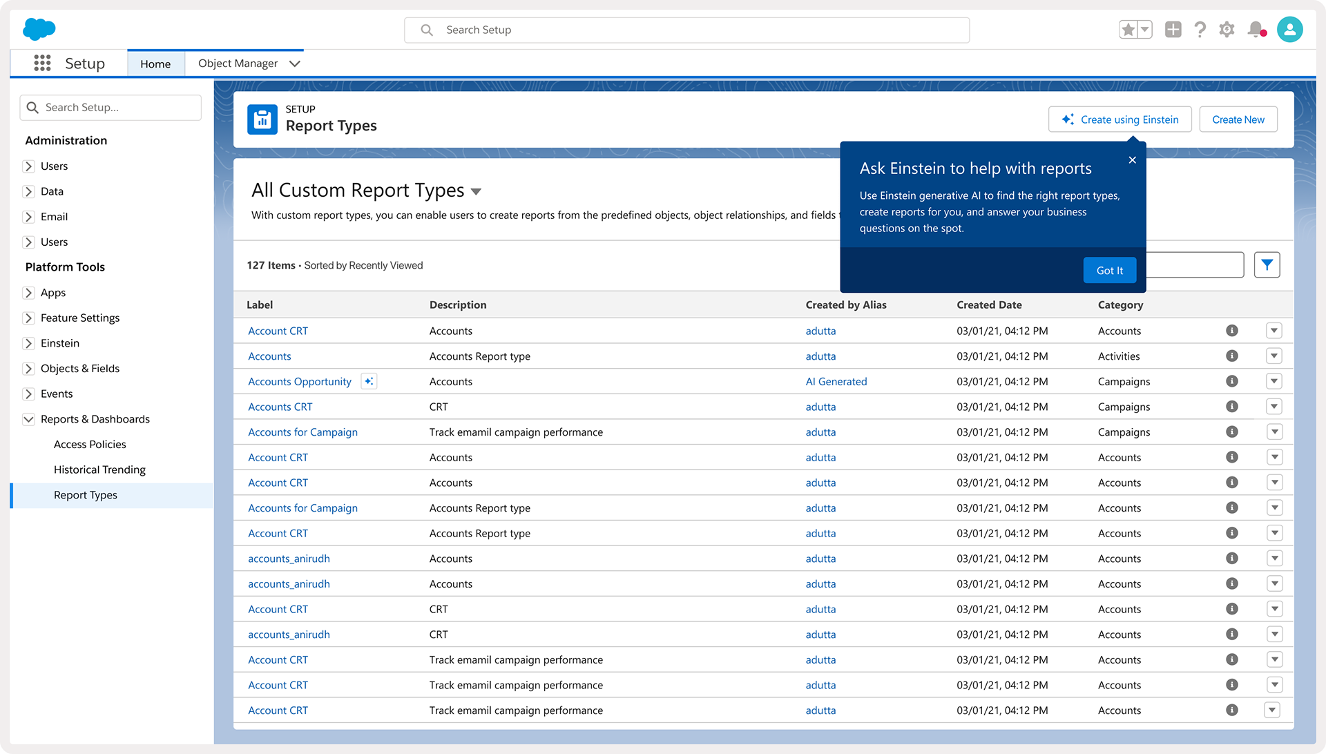
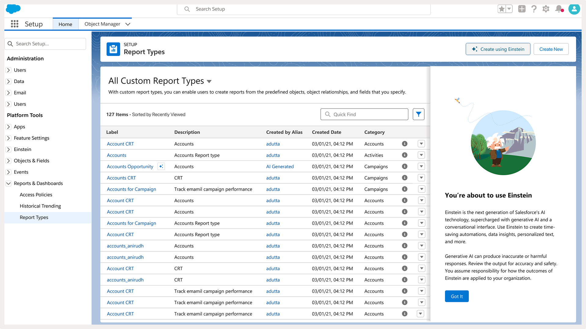
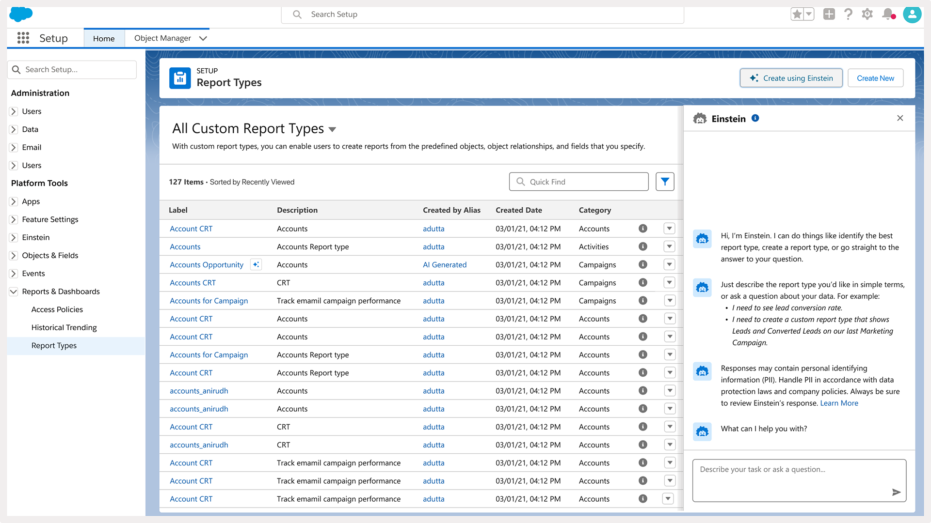
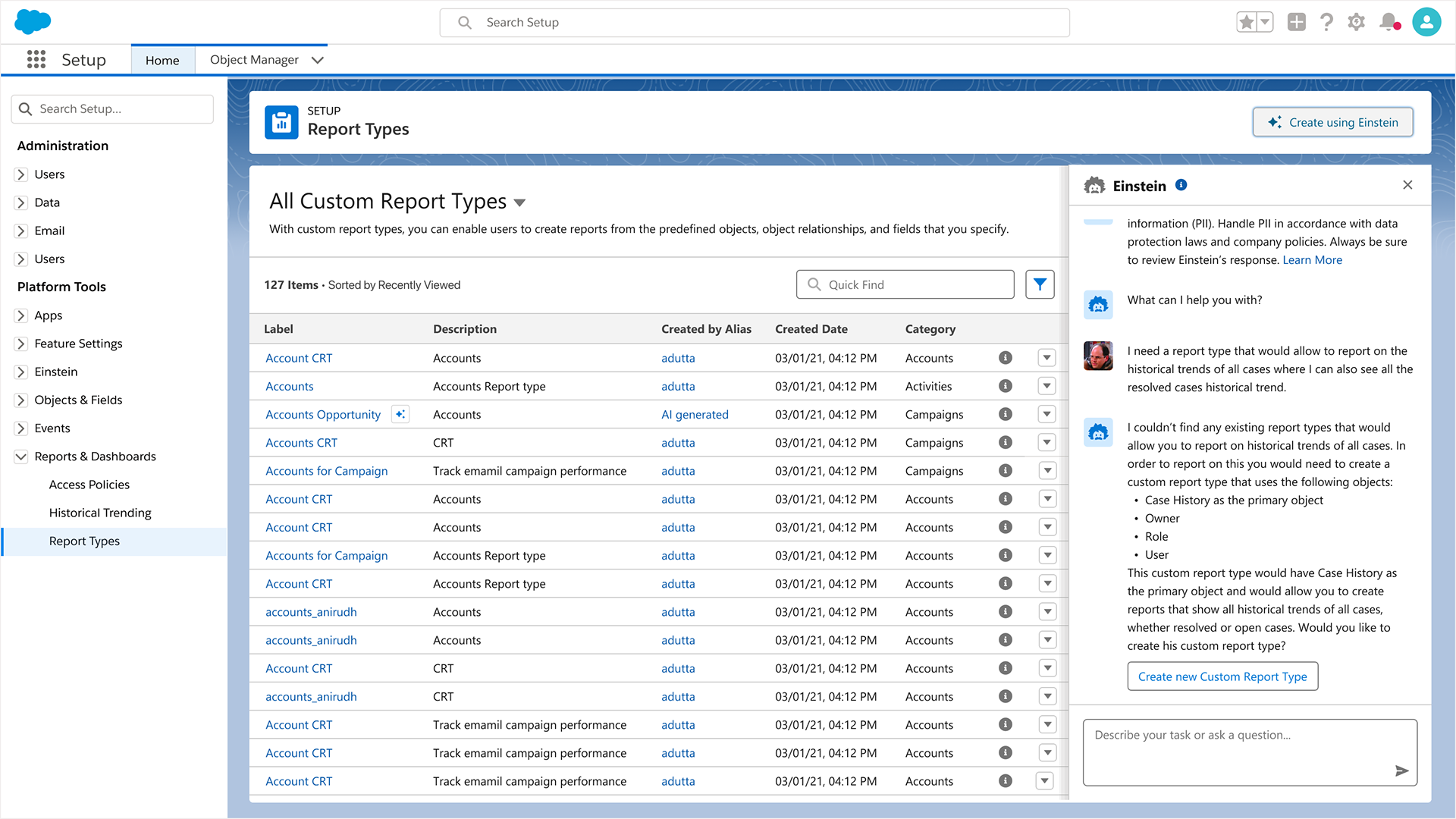
The team continued on the forward momentum and right after launching this initial redesign, we added our Einstein Copilot assistant (Chat GPT) to help our customers with their creation process of custom report types.


While our efforts in the initial redesign focused on the editing flows, our studies revealed that customers are dissatisfied with the creation flow of a new custom report type. We received feedback that the order of the different steps in the creation process don't make sense and it's hard to navigate back and forth from one step to another. I presented to the team a reimagined experience for creation new custom report types, where a user can see in one place all the steps of the creation process. This flow also aligns with how users create other data objects in Salesforce, which leans on delivering consistent creation design patterns in the entire Salesforce ecosystem. We are currently looking for budget to work on this part of the redesign.
